Button
cvui::button() renders a button. The common signature of a button function is:
bool button(cv::Mat& theWhere, int theX, int theY, const cv::String& theLabel)
where theWhere is the image/frame where the button will be rendered, theX is the position X, theY is the position Y, and theLabel is the text displayed inside the button.
All button functions return true if the user clicked the button, or false otherwise.
Adjust width and height
Button width will auto-adjust based on the size of its label. Below is an example of a button with auto-adjusted width (shown in Figure 1):
// cv::Mat frame, x, y, label
if (cvui::button(frame, 100, 40, "Button")) {
    // button was clicked
}
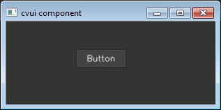
Figure 1: Button with auto-adjusted width.
It is also possible to specify the width and height of a button (shown in Figure 2):
// cv::Mat frame, x, y, width, height, label
if (cvui::button(frame, 100, 40, 100, 30, "Button")) {
    // button was clicked
}
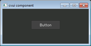
Figure 2: Button with custom width.
Image buttons
You can display a button whose graphics are images (cv::Mat). Such button accepts three images to describe its states, which are idle (no mouse interaction), over (mouse cursor is over the button) and down (mouse clicked the button):
bool button (
    cv::Mat& theWhere,
    int theX,
    int theY,
    cv::Mat& theIdle,
    cv::Mat& theOver,
    cv::Mat& theDown
);
The button size will be defined by the width and height of the images. E.g.:
cv::Mat idle = cv::imread("btn_idle_state.jpg", cv::IMREAD_COLOR);
cv::Mat over = cv::imread("btn_over_state.jpg", cv::IMREAD_COLOR);
cv::Mat down = cv::imread("btn_down_state.jpg", cv::IMREAD_COLOR);

// cv::Mat, x, y, cv::Mat, cv::Mat, cv::Mat
if (cvui::button(frame, 200, 80, idle, over, down)) {
    // button was clicked
}
Learn more
Check the image-button example for more information about buttons with custom rendering based on images.